About Brody Neuenschwander

Brody Neuenschwander is a calligrapher and text artist working in a wide range of media, from paper and canvas to textiles, metal and glass; from sculpture, light and architecture to film, performance and even human skin. He is obsessed with the fleeting nature of language. His work captures words for all time while conceding that they can never be grasped or fully understood. Neuenschwander is a dedicated teacher and has given workshops all over the world. Together with Dox Productions, London, he has recently completed a documentary on the history and future of writing for Arte, BBC and Nova.

WALL TO WALL

How would you like to collaborate with me on a new project? The castle of Hingene, near Antwerp in Belgium, is creating a time capsule in calligraphy. For a short time, all the wall hangings of the chateau will be taken down for restoration. The director of the castle, Koen De Vlieger, is taking this opportunity to ask the entire world (I’m not kidding) to send in messages that I will commit to eternity by writing them on the walls.

By |2022-01-26T22:21:23+01:00November 22nd, 2016|Archive|0 Comments

LET THE SPARKS FLY

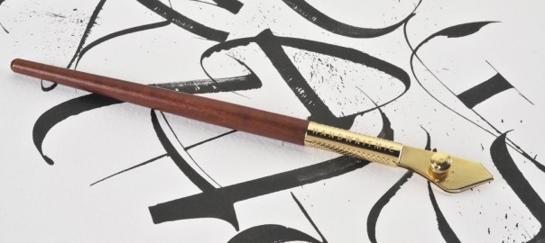
I would like to introduce you to the newest pen in my wonderful arsenal. I collaborated with Handwritmic (www.handwritmic.com) to develop this beautiful and extremely versatile ruling pen. The pens are hand crafted from the finest materials by craftsmen in the Biella region of Italy. The basic idea for this innovative new pen came from the German calligrapher Friedrich Poppl, but has been redesigned and vastly improved using the most advanced technology to create a tool with true Italian elegance and beauty.

By |2022-01-26T22:22:02+01:00October 17th, 2016|Archive|0 Comments

RIJKSBOOK 3

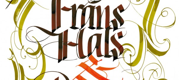
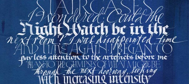
I have never been much for flourishes, as they distract from the form of the letters and belong too solidly to the past. But in this project, flourishes serve as fanfares to some of the greatest paintings in the world. Here I developed a rather unconventional style of flourish related to the strapwork decorations of 17th century architecture.

By |2022-01-26T22:22:30+01:00May 3rd, 2016|Archive|0 Comments

RIJKSBOOK 2

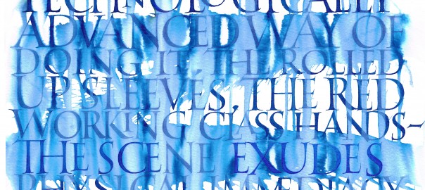
The Rijksbook took me back to my calligraphic roots, requiring me to do formal lettering in styles I had not practiced in years! Here is an example of Roman capitals, written with quill pen on Rives BFK paper using watercolor. The client asked for something special to accompany Vermeer’s “The Milkmaid”.

By |2022-01-26T22:22:44+01:00May 2nd, 2016|Archive|0 Comments

RIJKSBOOK 1

Since I failed to report on this project earlier, my dear readers seem to have done it for me! The Rijksbook was THE project of 2015, keeping Massimo Pollelo and me busy for at least half the year. You have already seen the videos and complained that the calligraphers are hardly mentioned at all by our illustrious client, Marcel Wanders.

By |2022-01-26T22:22:56+01:00May 1st, 2016|Archive|0 Comments

INTO THIN AIR 2

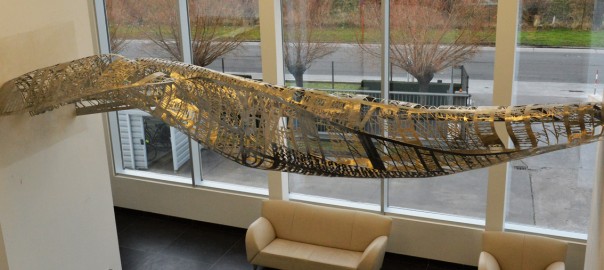
Hey Franky, thanks a million for your patience and incredible programming skills! The four plates in 2mm stainless that you lasered for me were perfect, but they were only the beginning. Nick Ervinck sliced my Photoshop rendering into sections, Thierry turned the sections into a wooden form, and Norbert and I hammered, cut and welded the steel until it fit the form; then polished it for weeks to achieve the final result.

By |2022-01-26T22:23:11+01:00January 25th, 2016|Archive|0 Comments

INTO THIN AIR

Never say no to a commission that you are not up to. Say YES and then get up to it. This sculpture, made for Mattheeuws Transport in Veurne, Belgium, brought me to my knees several times before it was done. It was thrilling to push myself and the materials beyond anything even the engineers thought possible. But here it is, 150 kilos of hammered stainless floating off into thin air.

By |2022-01-26T22:23:25+01:00January 24th, 2016|Archive|0 Comments

IN OTHER WORDS 2

The top floor of the old power station is an immense space with more than 260 windows. The artists of the Zandberg and my own students filled large sheets of Kozo paper with every kind of writing, mark, calligraphy and drawing. With these we created a black and white version of the Sainte Chapelle in Paris. The effect was incredible, as if you were entering into the collective brain of all the artists of the show.

By |2022-01-26T22:23:45+01:00January 22nd, 2016|Archive|0 Comments
Go to Top