Recorded lessons
Finding Inspiration in Non-Latin Scripts, Part 1
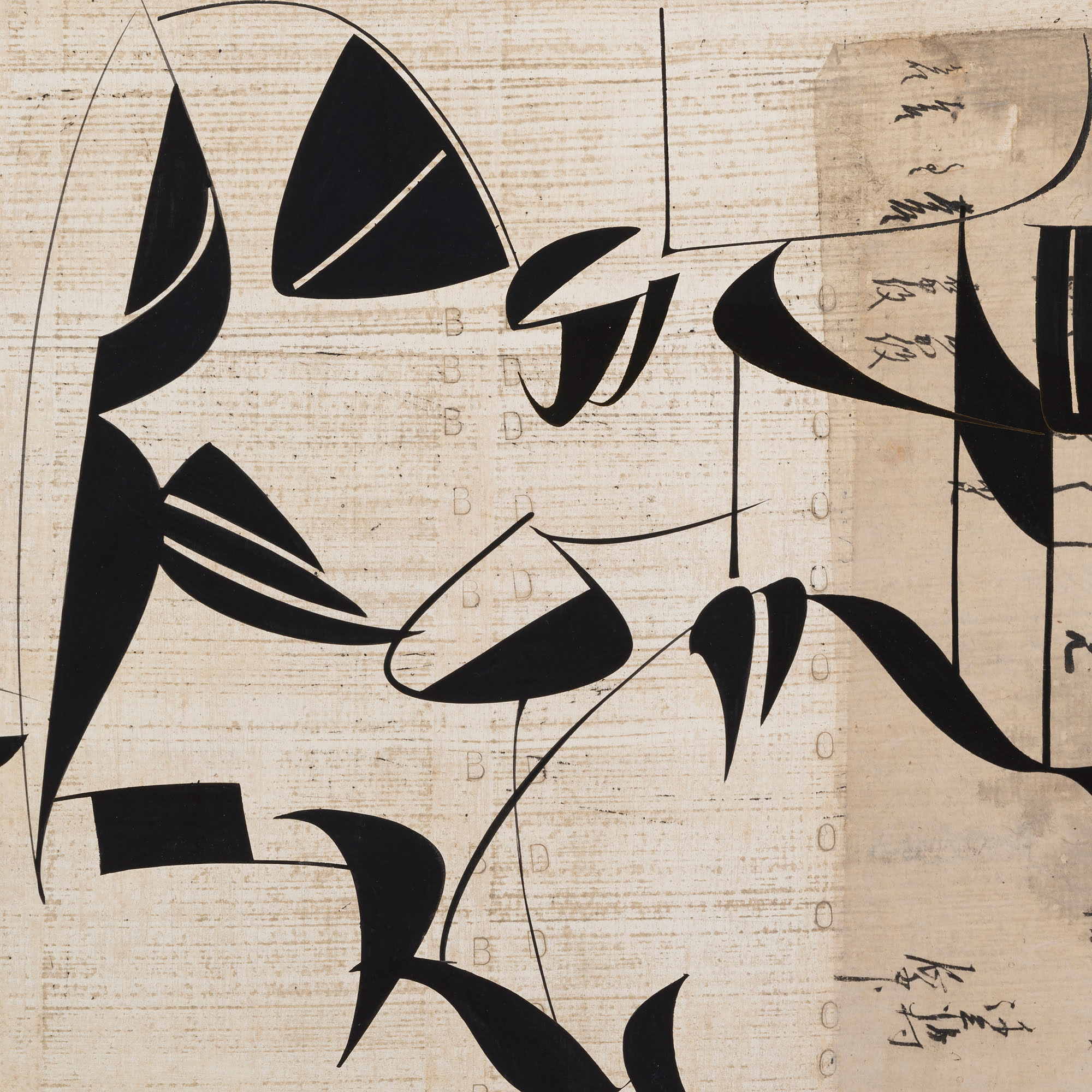
Come with me to a faraway land! I want to show you one of the most beautiful and intriguing scripts ever created: early Arabic Kufic. This calligraphy is as bold as modern sculpture and abstract painting. Think Calder. Think Motherwell. By studying these concise, dramatic letters, we can learn a lot about letterform, counterspace, weight and legibility. These sessions are great for anyone interested in striking out into new territory. Even better for logo designers, painters and those hoping to develop new and more personal styles of writing. Part 1 and part 2 together form a very good introduction to my way of teaching calligraphy.
Recorded lessons
Finding Inspiration in Non-Latin Scripts, Part 2
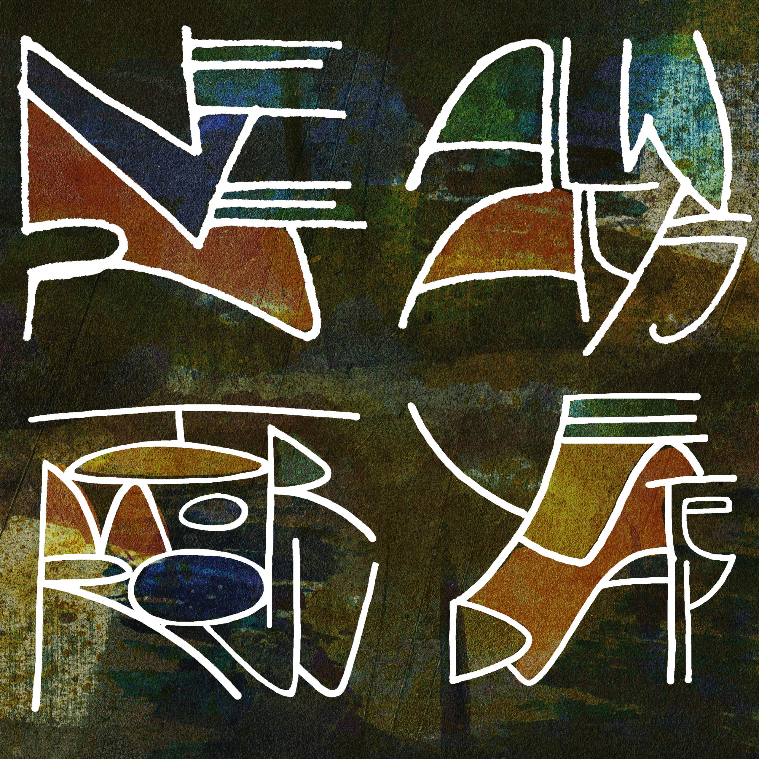
Magical words: ancient Chinese seal script! Have you ever looked at these wonderful characters closely? How are they constructed? Can they teach us new ways to shape and arrange Latin letters? Can words become images again? The answer is a resounding “Yes”! We will look at the construction of seal script characters and apply what we learn to Latin letters. This is a fantastic course for anyone interested in putting our alphabet together in new ways. If you have wondered how to create new textures and a different kind of flow from one letter to the next, this is the course for you. Part 1 and part 2 together form a very good introduction to my way of teaching calligraphy.
Recorded lessons
The Expressive Line, Part 1
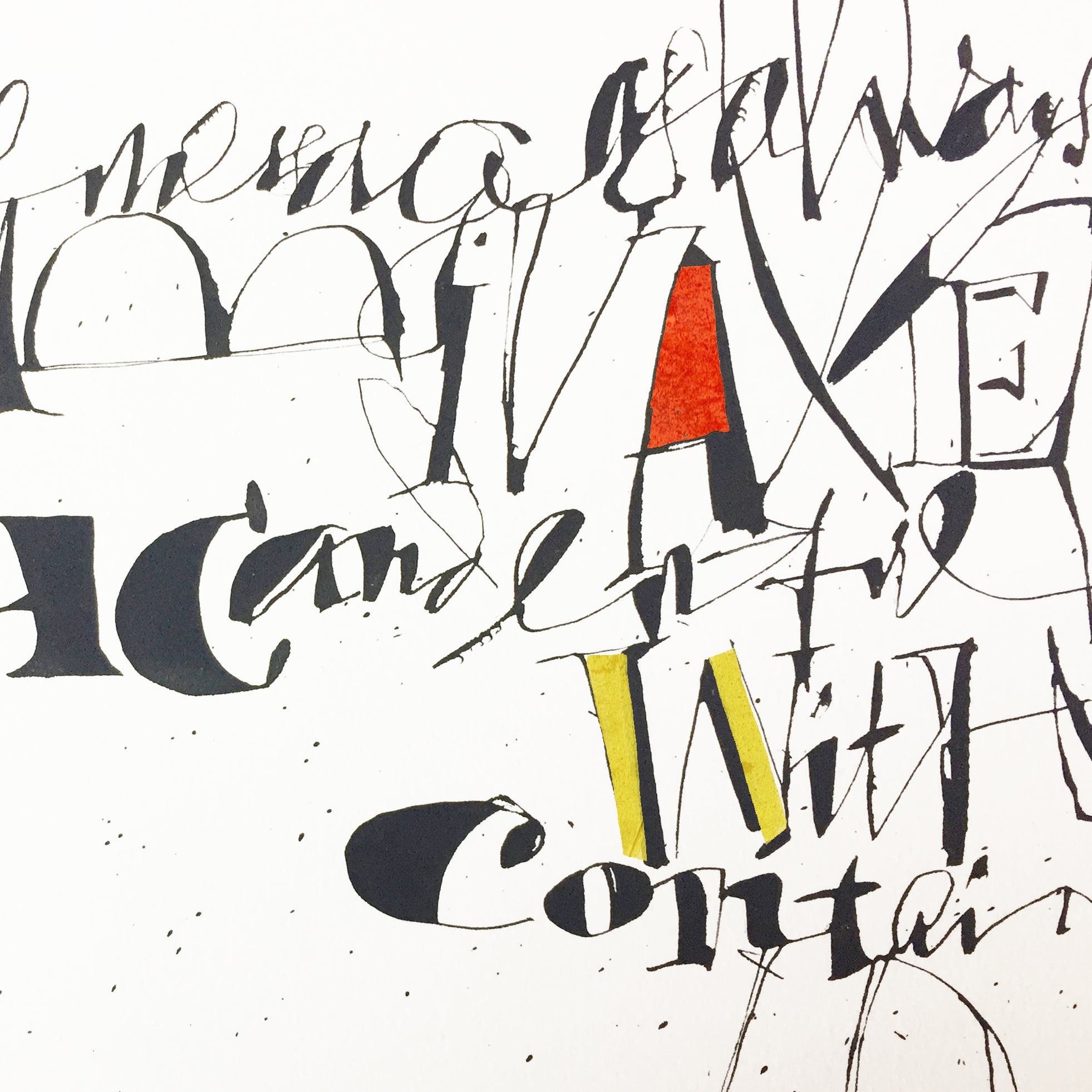
This course looks at all that is inky, spontaneous and full of life: the calligraphic line as a voyage of discovery. We begin with some outliers in the history of Latin letters, looking at how a line can move and shift instead of following a predictable path. We explore the flexibility of the quill pen, which is perfect for taking the line for a walk. This course looks at calligraphy as a process of drawing as much as of writing. Letters will be seen as shapes that you can alter radically without losing legibility entirely.
Recorded lessons
The Expressive Line, Part 2
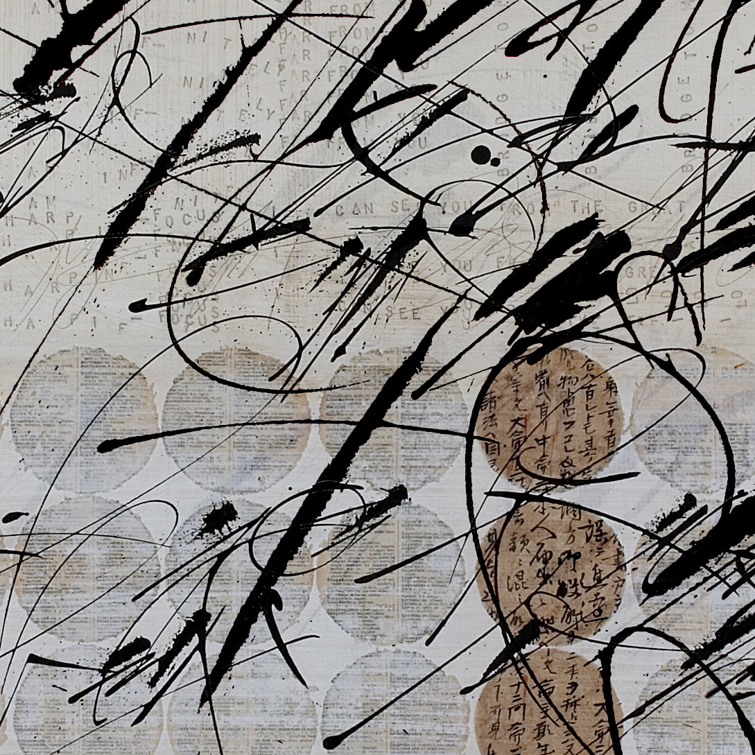
The cola can pen remains one of my favorite writing instruments. It is capable of so many things, from rough to smooth, from thin to thick, from splattered to refined. I show you how I use the pen and then define some principles by which you can develop your own gestural scripts without imitating other calligraphers. Script is, after all, a very personal form of expression. But finding your own voice is not always easy when there are amazing posts on Instagram every day that might exert a powerful influence over your work. We look at this problem very closely and see how you can create your own gestural style.
Recorded lessons
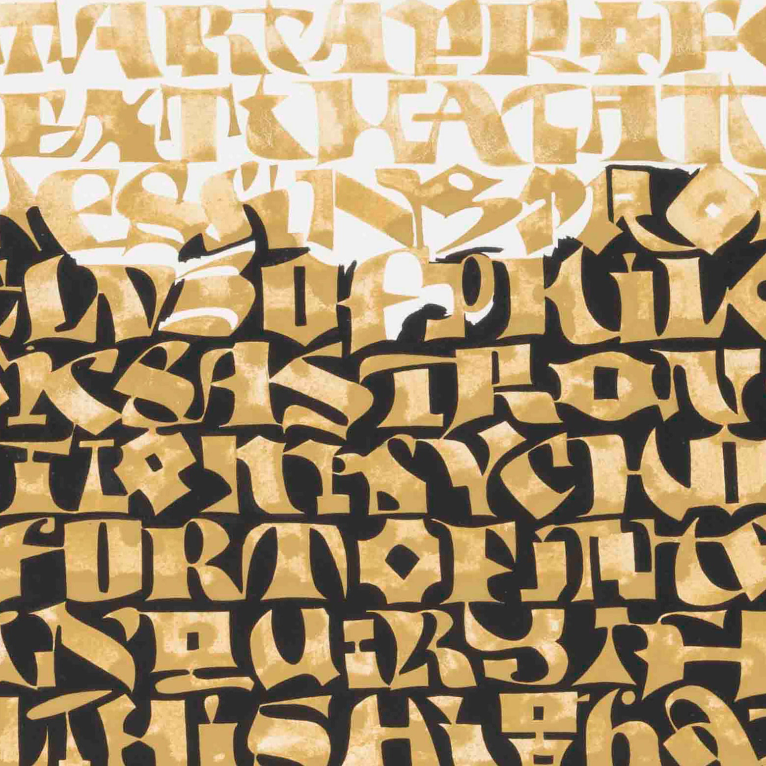
Wrong Letters: Graphic Drama with an Automatic Pen
Why would you want to make wrong letters? Because it’s a blast, that’s why. And because you can create black/white statements that are powerful, intriguing and inventive. All it takes is the will to break a few rules, and a push from me. We will use an automatic pen to push and pull our 26 Latin friends into new shapes. This will be slow, deliberate work, going for maximum tension between letters and the spaces inside and between them. I have had immense fun developing this calligraphic concept, which blends influences from all the scripts I have encountered in a long career.
Please join me for the fun!
Recorded lessons
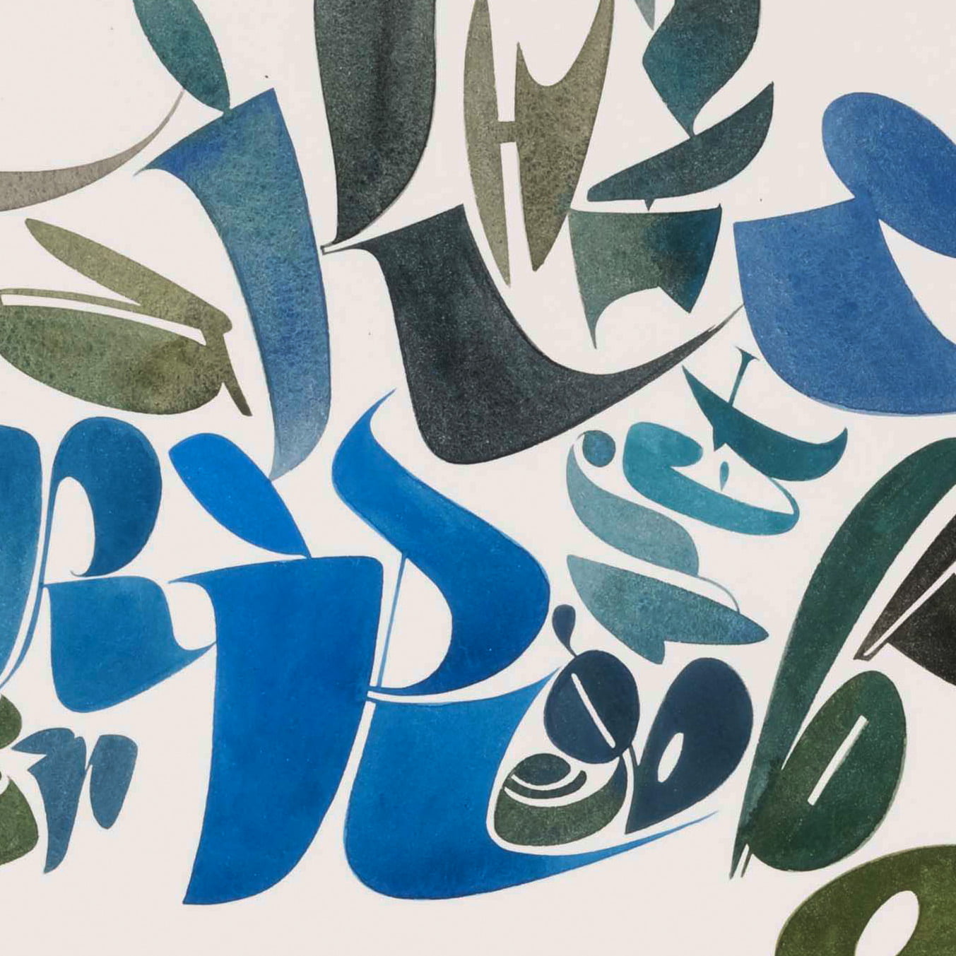
Wrong Letters: Fat and Juicy with a Pointed Brush
And now for my favorite fusion letters: Yellow Submarine. We will use pen and pointed brush to create these fat and juicy letters filled with lush colors. It’s not easy, I’ll be honest, but it is a truly enjoyable approach to making letters. We will bring together elements from various scripts, combining them to make letterforms with attitude. You have seen them on my Instagram. Now is the chance to try it out and find your own personal fusion. Participation in Series 5 recommended.
Recorded lessons
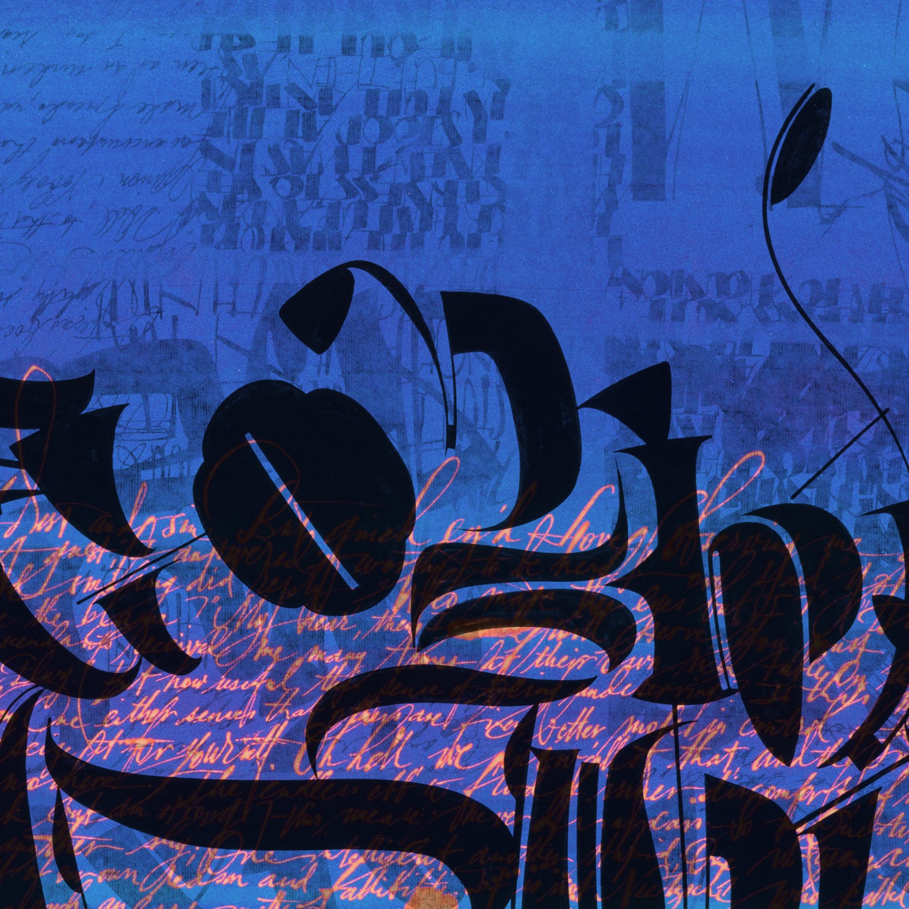
Wrong Letters: Lustrous Layered Colors
In this series we will take a deeper dive in our Yellow Submarine. In the last session you learned to make your own fat and juicy YS letters with a pointed brush. Now we will use a pointed pen (your choice: quill, ruling pen, copperplate pen…) to draw these luscious shapes and then fill them with color. Nuances in the bounding line, shadows and overlapping will give a sense of depth and layering. You will learn to make stunning compositions radiant with color and depth. Participation in Series 6 recommended.
Recorded lessons
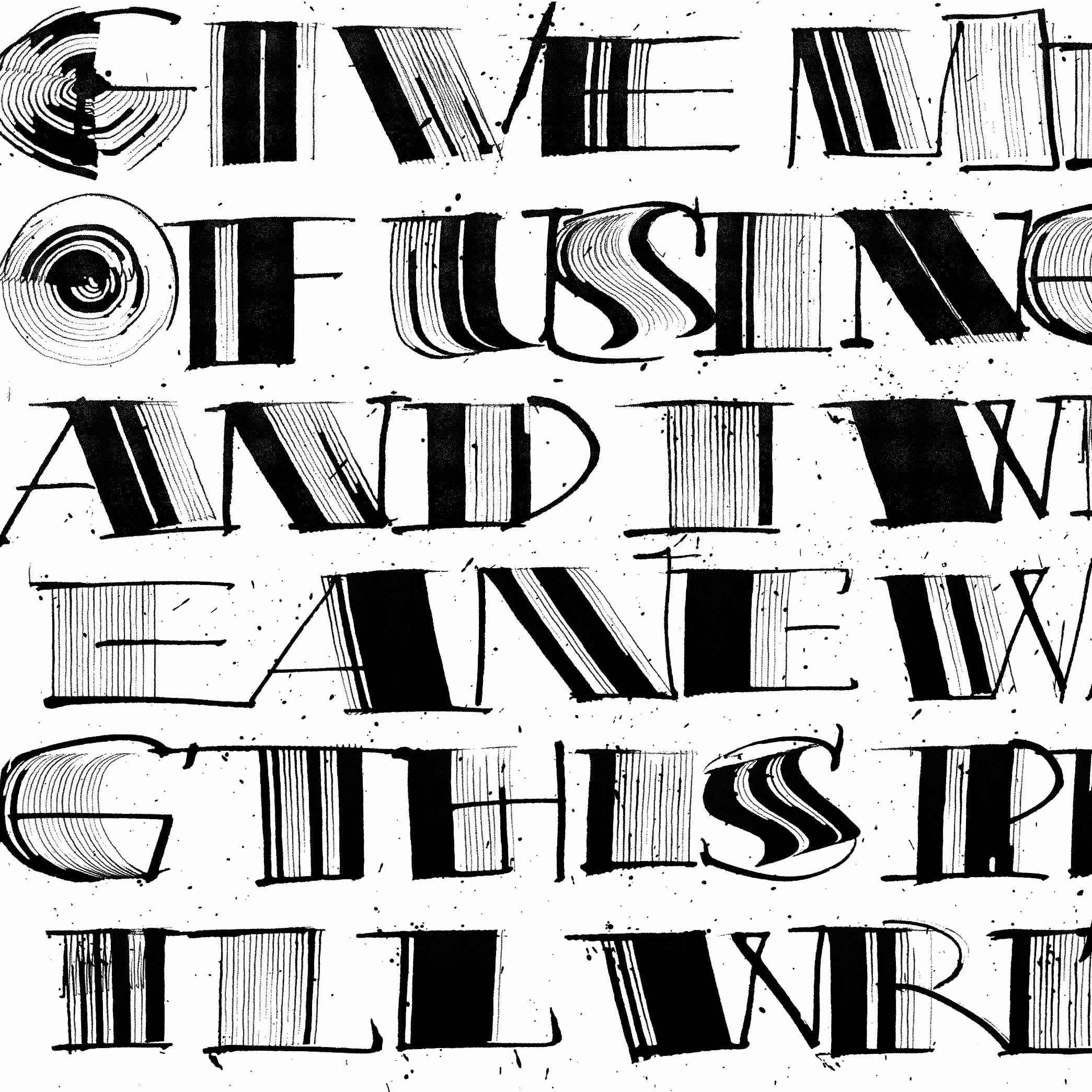
Wrong Letters: The Comb Pen and the Brody Pen
How is a comb pen like a wild mustang? Both are likely to throw you if you try to ride them! So we get up, dust ourselves off and try again. I’ll show you how I deal with this unruly pen to make outrageous, splattered, energetic letters. Nothing could be more fun! After that, we’ll look at my Handwritmic pen, which runs like a Ferrari. You need to keep your hands on the wheel here. I’ll give you a driving lesson but will not take responsibility for any accidents. After the lesson it will be up to you to put in the hours. These tools will not be tamed, but you can learn how to channel their energies.
Make contact
Questions? Need more info? Please feel free to fill in the form!
